My Role
My role in this project was to lead the UX strategy and vision. This was done by completing competitive analysis and researching specific industry trends; all to create a more digestible and easily navigable information architecture and user flows/journeys. I worked along side project managers, digital strategists, UI designers, and developers to create a modern responsive website for the economic development sector of the State of Nevada.
Project Overview
Nevada is becoming the place to be for economic development in the nation. It’s low tax structure, available land, and easy access to key air routes, ports, and interstates make it an ideal location for businesses across industries. The goal is to redesign and develop a new website for the State of Nevada's economic website, so that users can easily see the benefits and economic advantages for their business and choose Nevada as their next location.
The Challenge
Design and develop a website for the Governor’s Office of Economic Development (GOED). This website will be modern, mobile-responsive and conform to the recommendations laid out in the Governor’s Council on Developmental Disabilities and standard digital design best practices.
UX Challenges
Presenting economic stats and data in a way that makes the target user want to choose Nevada for their business. Remaining 508 compliant.
UX Goals
My goals were to improve user journeys, information architecture, and aid in content improvement for search engine optimization (SEO).
UX Approach
Conduct in depth research and auditing, to have a great foundation to build the best website that fits both the industry and targeted user archetypes.
Research & Design Plan
In addition to reviewing historical on-site engagement data, we implemented additional data collection mechanisms to identify off-site metrics tied into searchability and site performance.
We investigated many different areas (both on and off-site) to help us better understand Nevada’s presence online, the performance of the current site, the effectiveness of it’s user engagement, and its standing in comparison to some its competitors. We completed a competitive analysis and researching into specific industry trends.
Chosen research activities:
- Focus Groups
- Stakeholder Interviews
- User Interviews
- Archetype Evaluation
- Archetype Development
- Usability Evaluation
- Information Architecture Analysis
- Task Analysis
- Current State Task Flow Analysis
- Card Sorting & Future State Information Architecture
Archetypes
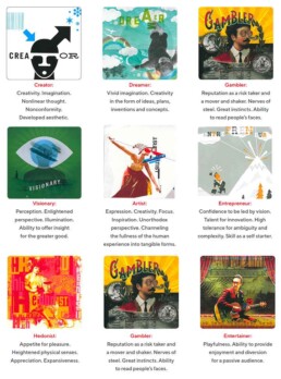
Archetypes embody the universal stories and journeys that all human being share. They also represent how we manifest the roles we play within those universal stories, the lessons we learn, and the paths we choose to walk.
The power of archetypes help to creatively and intuitively resolve brand inconsistencies and enhance trust with users.
The use of archetypes drive marketing, branding, design, and communication strategies that authentically integrate your most important values and visions.
Competitive Analysis
We looked at tax rates, incentives, population size, economy, lifestyle, and landscape data to determine which cities and states could be considered as competitors, when looking at different audiences and industry standards.
Through stakeholder interviews and review of state offerings, we considered these are state organizations comparable to Nevada.
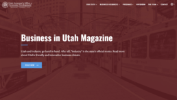
Utah's Governor's Office of Economic Development (GOED)
Similarities in cost of living, climate, and economic development
Utah's Governor's Office of Economic Development (GOED)
Similarities in cost of living, climate, and economic development
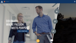
Colorado Office of Economic Development & International Trade
Similarities in lifestyle offerings and aspirational brand quality
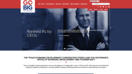
Texas Economic Development Corporation
Similarities in cost of living and economic development
Texas Economic Development Corporation
Similarities in cost of living and economic development
Hybrid Card Sorting Activity
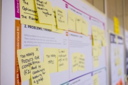
When prepping for the card sorting activity with the targeted users, we had to decide which type of card sort we wanted to do: open or closed. We decided on a hybrid card sort since the current information architecture was in a good starting place, so there was no need to reinvent the wheel, but we did want to leave it open in case the users wanted to suggest new labels for the future state.
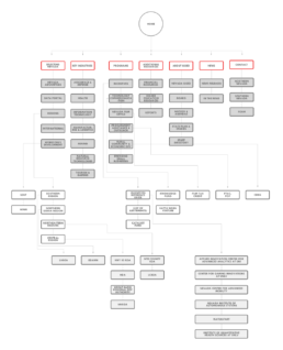
Site map and User Flows
After the card sorting activity, we took the results back to analyze them. Based off my research, card sorting results, and archetype qualities, I designed the user journeys to quickly find the information they needed and to not have any dead ends in the flow. This was brought back and presented to the users to validate the direction.
Design Solutioning
Now that we have research data, we can now jump into design solutioning. During this phase, I’ll start to digest the user stories. I’ll meet with digital strategist, creative director, project manger, and developers (front-end, service, and/or database) as needed during this time.
Once the story and scope is understood, I’ll start my typical process (all of which is iterated and validated along the way):
- Task flows
- Sketches
- White boarding
- Low fidelity wireframes > High fidelity mockups
- Prototypes
- Annotate design files and prototypes with notes and technical specifications
Wireframes to Mockups
These wireframes are showcasing how each page is focused on a specific archetype's needs.
01. Homepage Wireframe
Archetypes: All
01. Homepage Mockup
Archetypes: All
02. Key Industries Wireframe
Archetypes: Entrepreneur + Gambler + Creator + Visionary
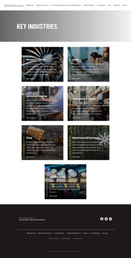
02. Key Industries Mockup
Archetypes: Entrepreneur + Gambler + Creator + Visionary
03. Selecting Nevada Wireframe
Archetypes: Dreamer + Artist + Hedonist
03. Selecting Nevada Mockup
Archetypes: Dreamer + Artist + Hedonist
The solution at launch
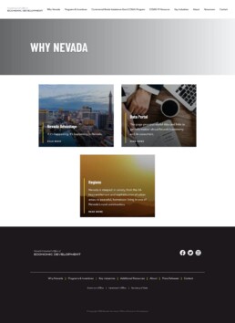
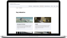
01. Web
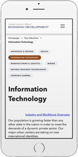
02. Mobile
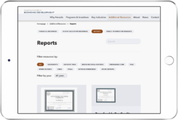
03. Tablet
Before & After
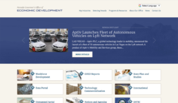
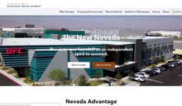
Take a look at the before and after of the hero section of the homepage.
Iterations through User Testing
I performed multiple scenario-based user testing sessions with Think Aloud protocol and invited other team members and stakeholders to observe the activity. Having silent observers is always helpful to get a “first-hand” understanding and clear insight of the user’s responses to our solution recommendations. It helped with distilling the assumptions and personal preferences too!
During user testing, I realized that I need to add a language selector for the website and add a few visual cues to aid in site navigation. The language selector was added to the header for easy access at all times. To address the navigation issues, I added breadcrumbs to internal pages, kept the page the user was on highlighted in the “yellow” color, and added a dropdown menu in the main navigation to show secondary navigation selections.
Once all testing sessions were completed for the sprint, I compiled a synthesized information in the form of a Usability Report. This deliverable helped our team and stakeholders to be in the loop with user feedback, necessary revisions and overall sense of success (or failure). Test early, fail early, rectify early.
"I sometimes have trouble understanding how to complete tasks in applications, but this is very easy and intuitive. Great work and thank you!"
- Improved usability and readability
- Improved information architecture
- Improved clarity in dialogue communication
- Improved visibility of system status
- Reduced time for information discovery
- Improved visual appeal
- Improved look and feel
"I was able to quickly find the information I was looking for and make an informed decision"
Thank you
I'm excited to launch the new Nevada Economic Development website. I would like to say thank you to The Abbi Agency and the Governor's Council for allowing me be a part of this awesome journey and helping put Nevada in the spotlight for new businesses.
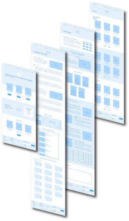
Wireframes
I created wireframes for all pages, modals, and interactions. I presented these mocks in InVision to the client and developers.
Great for clients to approve and iterate upon before developing
Used for prototyping in InVision
Used as a guide to the UI Designer
Used as a guide for the developers
