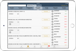
“The best thing about the Forge app is that there are no UX issues”
My Role
My role in this project was to lead the UX/UI strategy and vision and successfully incorporate the user centered design (UCD) practice into their agile process. I worked closely with the product owner, scrum master, and lead developer to develop a process that worked for all teams, without interrupting the current trajectory. The end process was an efficient 2 week sprint with design working ahead of development by 2+ sprints. We successfully integrated UCD into the current process while increasing the cadence of product releases, at the same time, creating an application that the miners actually looked forward to using in their day-to-day tasks.
Project Overview
The main goal was to create a brand new application, appropriately named "Forge", that will help the miners stay ahead of machine maintenance and also predict when to replace and order parts. This was estimated that it would save the company millions of dollars per year in costly repairs and decrease the down time for both miners in repairing the machinery and for the machinery being down for repairs.
The Challenge
This was also a brand new way for the miners to complete their work, which is a pro and con in itself. Currently, they were using outdated printed checklists to do their inspections. These checklist would either provide inaccurate information, no information at all, or even miss key elements for a through inspection. Since it was a manual process, the transfer of the checklists to the supervisors was slow. With the introduction of the application, updates to checklists were much faster and the transfer of completed inspections was instantaneous and real-time. Even if the supervisor was off-site, they were able to review notifications and review the checklists.
"I've been working this way for 30 years, why do I need to change now?"
UX Challenges
Creating an easy and intuitive product that aided the target users in completing their work for users that ranged in age from 18 to 65+.
UX Goals
My goals were to cut manual work in half, predict and maintain equipment before it breaks, and save the company money in costly shut downs.
UX Approach
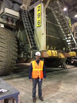
Have “boots on the ground”: meaning get out into the field and see how the miners were working and using technology in their roles.
Research & Design Plan
Since I was so new to the mining industry, I took a different approach to my research. I interviewed more people than usual, across a wide range of roles to understand the different needs for both the business and end users. I also spent a lot more time in the field to see how the users will use the product in a variety of environments (weather, above/below ground, etc).
Chosen research activities:
- Focus Groups
- Stakeholder Interviews
- User Interviews
- Surveys
- Persona Development
- Usability Evaluation
- Task Analysis
- Current State Task Flow Analysis
Personas
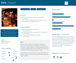
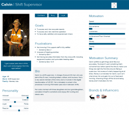
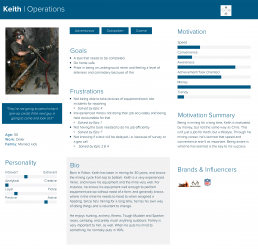
With the aid of focus groups, stakeholder and user interviews, and surveys, we identified 3 major personas: Support Crew, Shift Supervisors, and Operations Crew. The personas were created by using questions targeted at: User demographics, job position and years in current position, applications they use daily, comfort level with technology - scale of 1-5 with 1 being "Rarely use technology" and 5 being "Use technology all the time"
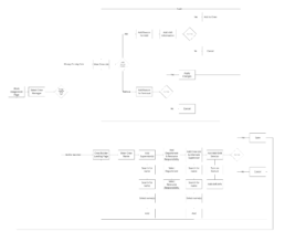
User Journey - Building A Crew
This is showing the full user journey for creating a new crew. The goal is for a Supervisor to build certain crews for certain shifts (day shift and night shift). This will help them be able to assign tasks to the individuals, in turn, the individual have complete transparency in knowing their tasks for the day as soon as their shift starts.
Design Solutioning
Now that we have research data, we can now jump into design solutioning. During this phase, I’ll start to digest the user stories. I’ll meet with product owner and developers (front-end, service, and/or database) as needed during this time.
Once the story and scope is understood, I’ll start my typical process (all of which is iterated and validated along the way):
- Task flows
- Sketches
- White boarding
- Low fidelity wireframes > High fidelity mockups
- Prototypes
- Annotate design files and prototypes with notes and technical specifications
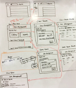
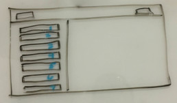
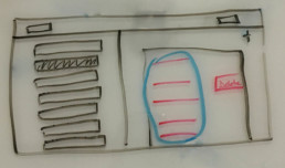
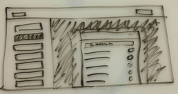
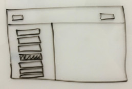
Sketches - Crew Builder Feature
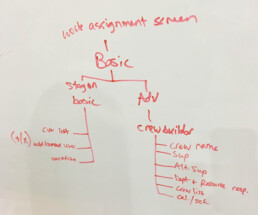
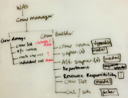
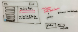
These sketches show the initial design and flow the user will take to get to the Crew Builder and what they will be able to accomplish once inside the Crew Builder.
Great for clients to approve and iterate upon before developing
Used for prototyping in InVision
Used as a guide for the developers
Mockups - Crew Builder Feature
The solution was driven by following the iOS Human Interface Guidelines since a majority of users were already using Apple products, as we learned from the research. We also decided to use a light interface, as opposed to a dark interface. This lighter interface proved easier to view the screen when both above ground and below ground while driving a rock truck.
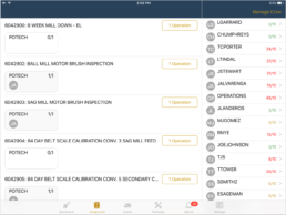
01. Assignment Allocation Screen (Supervisor View)
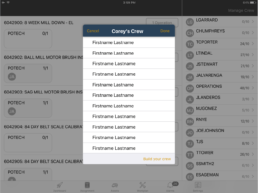
02. Manage Crew Modal
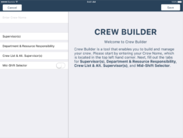
03. Crew Builder Page
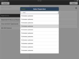
04. Select Supervisor Modal
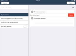
05. View & Edit Selected Supervisors Page
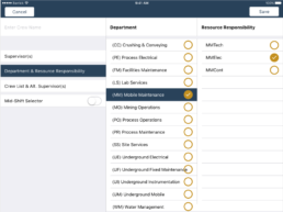
06. Department & Resource Responsibility Page
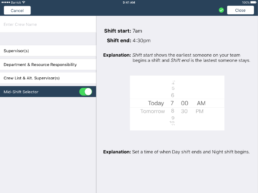
07. Mid-Shift Selector Page
The solution
The solution I ended up going with an app with a white interface (easier to see above and below ground) and following the iOS Human Interface Guidelines since a majority of users were already using Apple products.
01. Tablet
Iterations through User Testing
I performed multiple scenario-based user testing sessions with Think Aloud protocol and invited other team members and stakeholders to observe the activity. Having silent observers is always helpful to get a “first-hand” understanding and clear insight of the user’s responses to our solution recommendations. It helped with distilling the assumptions and personal preferences too!
Once all testing sessions were completed for the sprint, I compiled a synthesized information in the form of a Usability Report. This deliverable helped our team and stakeholders to be in the loop with user feedback, necessary revisions and overall sense of success (or failure). Test early, fail early, rectify early.
"I sometimes have trouble understanding how to complete tasks in applications, but this is very easy and intuitive. Great work and thank you!"
- Improved usability and readability
- Improved information transparency
- Improved clarity in dialogue communication
- Improved visibility of system status
- Reduced time for information discovery
- Reduced/or eliminated time for redundant tasks
- Improved visual appeal
- Improved look and feel
"I saved so much time during my day when using the Forge application"
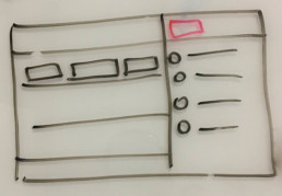
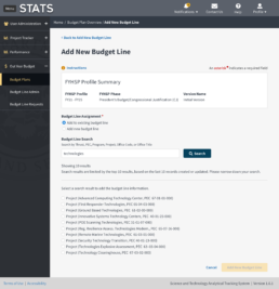
Here is the mockup before user testing. The flow is showing that the users choose a Budget Line Assignment, type in a search for a Budget Line, and the results show below the search field in a list using radio components for selection.
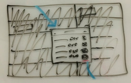
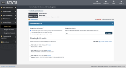
User testing results were showing that the layout of data was not easy to read and there was no way to filter the results. This feedback was taken back and we came up with this new flow and user interface (UI). After testing the new flow and UI, the results were 100% success and approval rate.
Summary
- Interview stakeholders to learn scope, acceptance criteria, and their vision.
- Study the app. What can it do, what is the branding, and where does this new feature belong?
- Get out into the field. Talk to target users, see what environment they’ll be using it in, learn their skill level with technology.
- Research. Is there something out there that is/is not doing this well? (and why?)
- Sketch (pen & paper/whiteboard). Now that I have all of the information I need, I’ll start working on the flow.
- Test/iterate/refine.
- Add more fidelity.
- Test/iterate/refine.
- Add more fidelity.
- Present deliverable to stakeholders.
Throughout this process, I’ll include stakeholders and developers to get their thoughts. I find this is very helpful so the stakeholders can see the process and so developers aren’t getting something that is impossible to build within their timeframe.
